User Experiences
Company
Mazama
Casey (myself) - Sole UI/UX Designer
Team
Carson, Callista, Leo - Developers
Drayson - Creative Director
Marta - Graphic Designer
Kaeden - Copywriter
Makenzie - Project Manager
I began working on Mazama’s web forms in December 2022 when they were a scattered and inconsistent mess. In the small-team startup environment, these forms had been haphazardly thrown together as a way to collect user information in an automated sign-up process, connecting low-income Americans with free internet or phone plans. Although the forms were serving their purpose, they were filled with issues. The team had no UI/UX designer until I took over those responsibilities, and it was clear we needed to start updating and overhauling these forms to maintain user satisfaction.
As the sole UX Designer, I collaborated closely with the rest of the creative team as well as our developers, stakeholders, and ever-involved CEO. Our small team required constant advocacy for user choice, a new concept to our decision-makers, making stakeholder alignment a critical aspect of this ongoing project.
Project Overview
Initial Challenge
The existing user experience was fraught with user frustrations. Around 60% of users ended up at a dead end because we ran different conversion funnels for each of our 8 clients, meaning if that internet/phone provider wasn't available in the user’s area, it was game over for them. Even for those who could get service, the journey from Advertisement → Chatbot → Web Form → Back to Chatbot → Call Center was convoluted and confusing.
Our vision was to create a more intuitive and user-friendly experience by consolidating separate provider flows under one umbrella, broadening service availability and reducing dead ends.
Phase 1: Enter FreeConnect
To address the high drop-off rates and user frustration caused by fragmented provider flows, we introduced our in-house brand, FreeConnect, in early 2023. Our goal was to consolidate multiple client-specific sign-up processes into a single, streamlined flow. This move aimed to decrease user drop-off by broadening service availability; a user who wasn’t serviceable by one provider still had the chance to be covered by others.
The Creative Director and I began by mapping out the existing user flows (shown above) and combining them together before wireframing the new web form experience. This helped us understand the complex web of different client flows and small provider-specific requirements that I would have to account for in the design of this new consolidated form.
New & Improved Web Form
We began working on FreeConnect after my design system had been implemented, bringing much-needed standardization to the various providers’ web forms, making them easier to unify. I took all the components I’d designed and swapped out branding and styling for that of FreeConnect, which our Creative Director and Graphic Designer had helped build out in the weeks leading up to this overhaul.
Design Challenges and Solutions
Challenge #1: Prolonged Wait Times
One significant challenge in the design phase was that combining serviceability checks for all providers could extend the wait time by up to 30 seconds, leading to a prolonged wait for users. To address this, we knew we needed a customized loading blocker to make the wait more pleasant, but that alone wasn't enough. After brainstorming various ideas, I realized that although we had been using the same page structure throughout the life of our forms, we weren't restricted to it. This realization allowed me to move the Address page to the start of the form rather than the end, enabling the serviceability check to run in the background while the user filled out other required information. I also created a custom loading animation (shown in the Animation section) in case users still had to wait.
Challenge #2: Brand Guidelines vs. Templatization
Designing branded pieces of creative for the provider/offer reveal also posed its own challenge due to the need to ensure consistency with each provider's brand guidelines while still aligning with the overall aesthetic of FreeConnect, and effectively showcasing the offer to users in an enticing and clear manner.
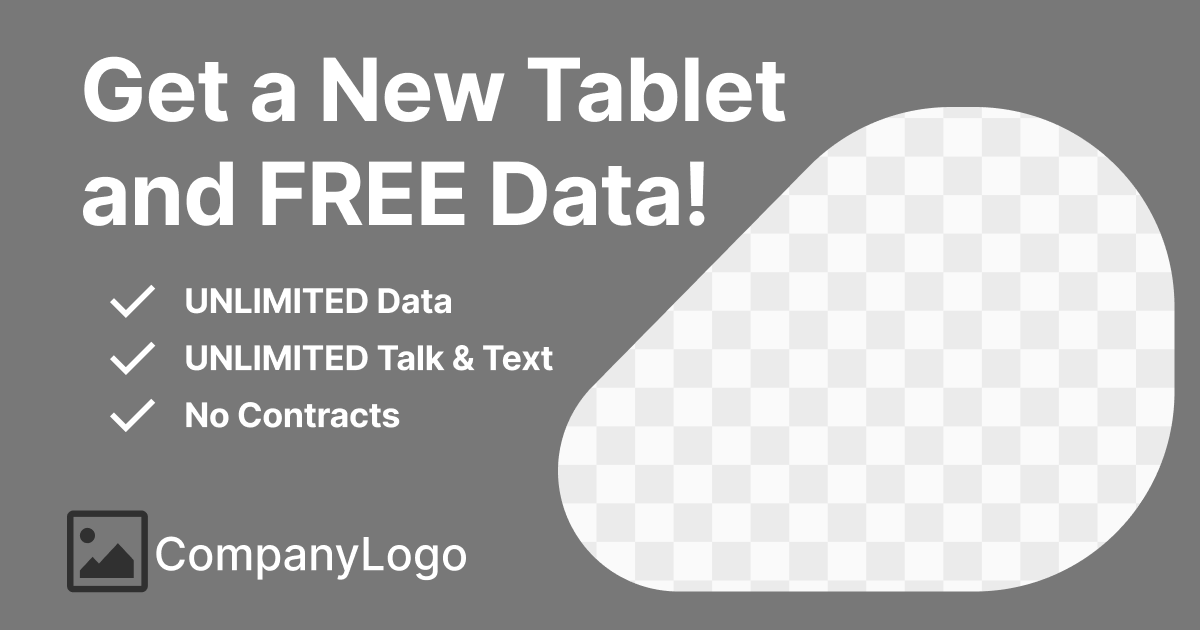
To overcome this, I first designed a template to be used for each provider with generic assets and language, adhering to a clear visual hierarchy. This template featured a clear and concise statement of the offer, paired with value propositions underneath to inform and excite users about their offer. I left room for eye-catching imagery to captivate attention and provide visual relief and included a space for the provider’s logo at the bottom for brand recognition and trust. I customized this template for each client with their unique branding and assets, ensuring every offer was both engaging and aligned with their identity, and of course, I had to change the template slightly for certain providers with more rigid brand guidelines.
We even split tested this content to see if using iconography would work better, but the results indicated it had no substantial impact on conversion.
Challenge #3: Flow Differences
There were also inherent differences in the Wireless and Internet provider flows; because we were still working with the ACP (Affordable Connectivity Program) at the time, Wireless required users to verify their eligibility through a government website, while Internet often required users to speak with a call agent to confirm their offer and schedule an installation date. To solve this, I created a split in the path for wireless and internet services at the end of the web form: wireless-qualified users would be redirected to the chatbot for better assistance in getting their application approved through the government, while internet-qualified users would be urged to dial our call center, as it was the quickest way to confirm their offer and schedule their installation date.
Main Deliverables
Mobile
Tablet
Desktop
(Mockup - uses Tablet design inside a container)
Impact and Success
The implementation of FreeConnect was a tremendous success. It significantly reduced wasted advertising spend and minimized dead-end leads by around 43%, ensuring that almost every user had access to at least one viable offer. This initial test demonstrated the potential for a more integrated system, boasting a 22% reduction to bounce rate, a 19% increase in user satisfaction according to surveys, and setting the stage for future improvements and user-centric enhancements. However, this also introduced new issues, such as users not being able to select an offer within the form. Addressing these new challenges became the next focus of our ongoing improvements.
Reduction in Dead-End Leads
43%
22%
Reduction to Bounce Rate
Increase in User Satisfaction
19%
Phase 2: Offer Flow
Building on the success of FreeConnect, which significantly streamlined our sign-up process, there was a clear opportunity to further enhance user choice and satisfaction. While FreeConnect marked a significant improvement by consolidating provider flows, user research showed they still desired more autonomy in selecting their service options. During this time, funding for the ACP had also dried up, and government proposals to renew the program that gave free internet/phone service to low-income Americans had all been rejected. This led to a shift away from wireless providers, who relied heavily on the ACP, and we redirected our efforts toward offering low-cost internet plans, onboarding numerous new internet providers.
Understanding User Needs
In our research, we found that users were turning to other comparison websites to explore internet service options. These platforms, however, often returned a broad range of service options based solely on a user’s zip code, leading to many offers that weren’t actually available at the user's specific address. This discrepancy resulted in users being directed to multiple providers' call centers, which wasted time and led to frustration.
In response, we designed a streamlined approach that focused on clarity and accuracy in presenting service options based on the user's location. This approach aimed to eliminate unnecessary steps and provided users with a more efficient sign-up process.
Key Features
Location-Specific Offers: Offers were tailored based on the user's specific location rather than generalized by zip code. This approach ensured that users received relevant information about service availability directly applicable to their area.
Simplified User Interface: We prioritized a user-friendly interface that simplified the selection process while still providing users with the opportunity to learn more about each of the plans available to them.
Clear Pathways to Action: To enhance user engagement, we implemented clear calls-to-action that guided users through the sign-up process step-by-step, minimizing confusion and maximizing completion rates.
Reduced Call Center Dependency: This new flow significantly reduced the need for users to talk to our call center. Previously, every user had to speak with someone on the phone to complete their signup. By including an offer selection and a confirmation page, users who didn’t require an identity check and didn’t have an outstanding balance could finish their entire signup process online. This change meant that about half the users could complete their sign-up without any phone interaction.
The Design Process
1. Information Gathering and Concepting
Outlined essential elements for the Offer Card: Speed, Price, Offer Selection Button, Value Propositions, Disclaimer, Badges (later removed), and Dropdown with Additional Information.
Researched and gathered design references, including insights from Google Flights for its efficient use of space.
2. Concept Presentation & Feedback
Presented early concepts and reference to the Creative Director, focusing on how to pack extensive information into a compact design, crucial for our mobile-first approach
I also highlighted the things I liked most about the reference shown above and outlined my plan for the design, breaking down what features I wanted to include or test and why
Developed higher-resolution versions of these concepts to assess their viability with our brand and requirements
Received feedback on these higher-res versions, leading to the selection of a final design direction
Problems with the selected design:
3. Iteration and Refinement
Addressed issues with the selected design, like excessive empty space and jarring experience when expanding and collapsing the card
Explored and prototyped various solutions, including repositioning the “Show More” dropdown and content alignment
Finalized a solution that added a third section below the existing two, allowing for smooth expansion and collapse without disrupting the layout
Design Progression at its finest…
4. Collaboration and Finalization
Worked with the graphic designer to incorporate branded icons into the design
Collaborated with the copywriter to develop compelling headers, subheaders, and descriptions for each offer
Secured final approval from the Creative Director and prepared the finalized component for the development team
Maintained close communication with developers to ensure the design was feasible and practical for implementation
Deliverables
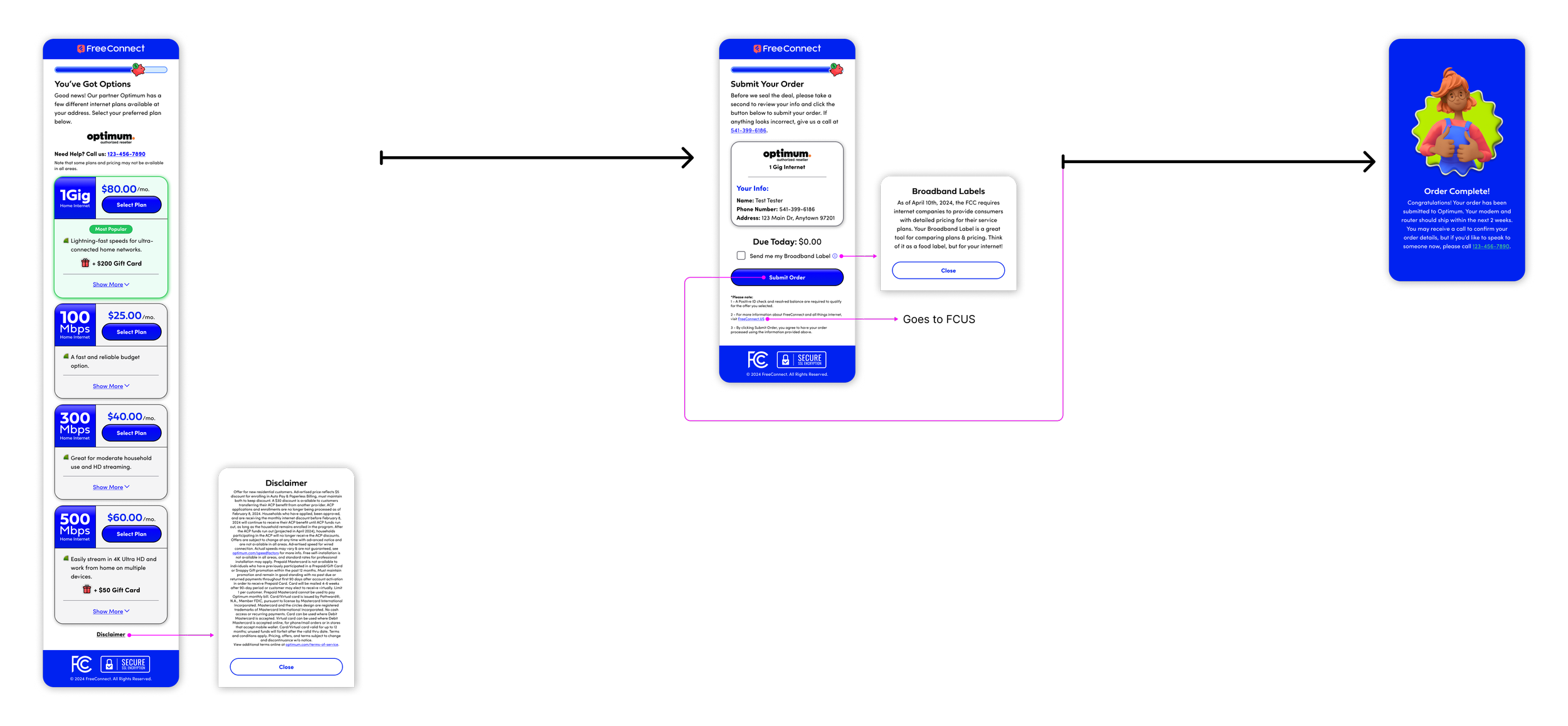
I delivered the component shown above along with a thorough breakdown of functionality, scaling, links to assets, outlines of spacing, and more. I took advantage of Figma’s newly released (at the time) Annotation feature in dev mode to leave all of my comments but keep them hidden by default. Also included in this deliverable was the flow containing the new Offer page as well as the new Submit and Order Complete pages. While I didn't delve into as much detail on these pages, they followed a similar but more straightforward process as the Offer Card.
Component Breakdown
Flow (simplified)
Impact and Success
The revamped Offer Flow achieved significant improvements in user experience. By integrating offer selection directly into the web form, I reduced the need for users to contact our call center by about 50% and increased our close rate per lead by 38% . Our front-end developer and I also squeezed a last-minute change into the deployment, highlighting the highest speed offer, which led to a 67% increase in upsells. The address-specific serviceability check proved crucial, offering users a more accurate view of available services compared to competitors. This approach ensured that users received relevant offers and could complete their sign-up online, reinforcing our commitment to user autonomy and efficient service enrollment.
Reduction in Unnecessary Calls
50%
38%
Increased Close Rate
Increase in Upsells
67%
Future Improvements
The phases outlined above represent significant milestones in our web experience overhaul, but our commitment to continuous improvement is unwavering. We regularly release new builds, updates, and enhancements to ensure our forms are not only functional but intuitive, enjoyable, and accessible for all users.
Looking ahead, the next phase of development will focus on creating a more familiar shopping experience: enabling users to view their eligible providers as early in the process as possible and giving them the ability to select their offer before asking for any personal information.
Up Next…
→ View Providers
→ Offers Before PII
→ Combine Address x Welcome Pages
While navigating the challenge of balancing user advocacy with the business goals of profitability, I’m constantly presenting strong evidence showing that prioritizing user satisfaction ultimately leads to a more successful business. We’ve celebrated numerous wins so far, and I’m excited to continue delivering innovative solutions that benefit both our users and the business alike.


